JupyterBioacoustic supports custom visualization functions alongside the built-in spectrograms. Several are included in jupyter_bioacoustic.utils.visualizations and can be referenced by name. Custom functions can also be passed directly as callables.
Each function takes (mono, sr, width) and returns a dict with either a matrix (2D array — rendered automatically) or png_bytes (full control).
Author: Brookie Guzder-Williams (bguzder-williams@berkeley.edu)
Affiliation: The Eric and Wendy Schmidt Center for Data Science & Environment
from jupyter_bioacoustic import BioacousticAnnotator
import jupyter_bioacoustic.audio.io as io
from jupyter_bioacoustic.utils import visualizations as vis
import numpy as np
from pathlib import Path[JBA] Debug mode enabled. Logs → /Users/brookie/code/dse/jupyter_bioacoustic/repos/jupyter_bioacoustic/demo/jba_debug.log
%matplotlib inlineDATA = 'data/detections.N-dse.csv'
AUDIO = 'audio_url'
LOCAL_AUDIO_PATH = 'audio/test_auido.flac'
SAMPLE_AUDIO_URL = 'https://dse-soundhub.s3.us-west-2.amazonaws.com/public/audio/dev/20230522_200000.flac'1. Built-in Visualizations by Name
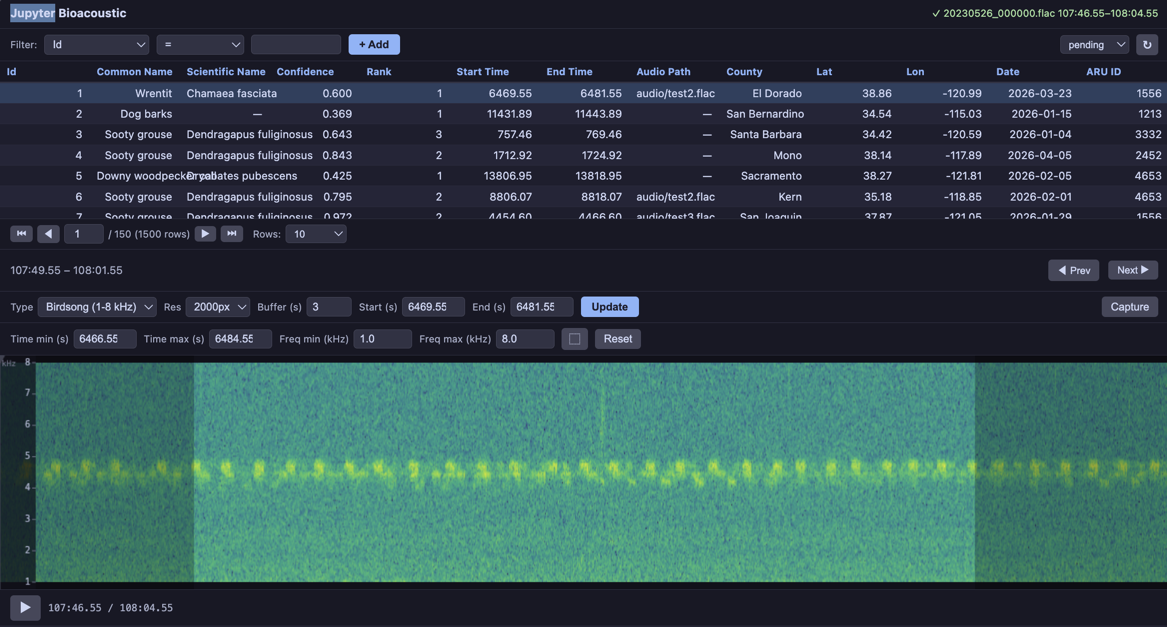
The visualizations module includes several ready-to-use functions that can be referenced by string name: 'spectrogram' (or 'plain'), 'mel', 'log_frequency', 'bandpass', 'waveform'.
BioacousticAnnotator(
    data=DATA,
    audio=AUDIO,
    display_columns=[AUDIO],
    visualizations=[
        'plain', 'mel', 'log_frequency', 'bandpass', 'waveform'],
).open()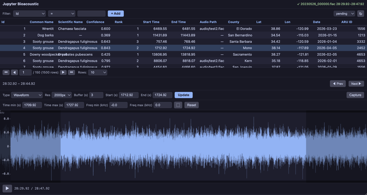
2. Standalone Usage
The visualization functions can be used outside the widget — for analysis, figures, or custom pipelines. The vis.plot() helper renders any visualization dict as a matplotlib figure.
Note: the first time you run this code an audio-file will be downloaded
audio_path = Path(LOCAL_AUDIO_PATH)
if not audio_path.exists():
    print('Downloading Sample Audio: this may take a moment...')
    _ = io.read(SAMPLE_AUDIO_URL, audio_path)
    print(f'- audio saved ({_})')
Downloading Sample Audio: this may take a moment...
- audio saved (audio/test_auido.flac)
import soundfile as sf
# Load 15 seconds of audio
audio_data, sample_rate = sf.read(LOCAL_AUDIO_PATH)
duration = 15
mono = audio_data[:sample_rate * duration].mean(axis=1) if audio_data.ndim > 1 else audio_data[:sample_rate * duration]
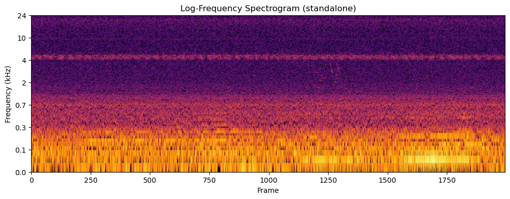
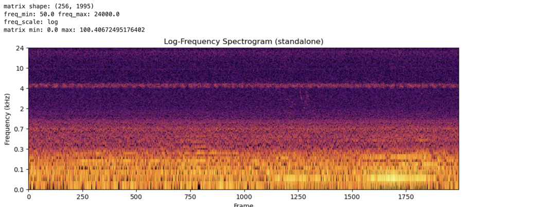
# Generate a log-frequency spectrogram
result = vis.log_frequency(mono, sample_rate, 2000)
print('matrix shape:', result['matrix'].shape)
print('freq_min:', result['freq_min'], 'freq_max:', result['freq_max'])
print('freq_scale:', result['freq_scale'])
print('matrix min:', result['matrix'].min(), 'max:', result['matrix'].max())
# Plot it standalone — vis.plot() returns (fig, ax)
fig, ax = vis.plot(result, cmap='inferno')
ax.set_title('Log-Frequency Spectrogram (standalone)')
fig.savefig('log-freq-standalone.png')
figmatrix shape: (256, 1995)
freq_min: 50.0 freq_max: 24000.0
freq_scale: log
matrix min: 0.0 max: 100.40672495176402
3. Custom Visualization Function (PNG return)
For complete control over the rendering — custom colormaps, dynamic range, etc. — use vis.render_png() which handles dB normalization and colormap rendering. For even more control (custom layouts, overlays, multi-panel), render with matplotlib directly and return png_bytes.
import matplotlib
matplotlib.use('Agg')
import matplotlib.pyplot as plt
import io


def waveform_and_spectrogram(mono, sr, width):
    """Composite: waveform on top, spectrogram on bottom, single PNG.

    This example renders with matplotlib directly for full layout control.
    """
    fig, (ax1, ax2) = plt.subplots(2, 1, figsize=(width / 100, 5),
                                    gridspec_kw={'height_ratios': [1, 3]}, dpi=100)
    fig.subplots_adjust(hspace=0.05)

    t = np.linspace(0, len(mono) / sr, len(mono))
    ax1.plot(t, mono, color='#89b4fa', linewidth=0.3)
    ax1.set_xlim(0, len(mono) / sr)
    ax1.set_ylabel('Amp', fontsize=7, color='#cdd6f4')
    ax1.tick_params(labelsize=6, colors='#6c7086')
    ax1.set_facecolor('#1e1e2e')
    ax1.spines[:].set_visible(False)

    ax2.specgram(mono, Fs=sr, NFFT=1024, noverlap=512, cmap='inferno')
    ax2.set_ylabel('Hz', fontsize=7, color='#cdd6f4')
    ax2.tick_params(labelsize=6, colors='#6c7086')
    ax2.set_facecolor('#1e1e2e')
    ax2.spines[:].set_visible(False)

    fig.patch.set_facecolor('#1e1e2e')
    buf = io.BytesIO()
    fig.savefig(buf, format='png', dpi=100, bbox_inches='tight', pad_inches=0.02)
    plt.close(fig)

    return {
        'png_bytes': buf.getvalue(),
        'freq_min': 0.0,
        'freq_max': sr / 2.0,
        'freq_scale': 'linear',
    }


def inferno_spectrogram(mono, sr, width):
    """Plain spectrogram rendered with 'inferno' colormap via vis.render_png()."""
    result = vis.spectrogram(mono, sr, width)
    png = vis.render_png(result['matrix'], width=width, cmap='inferno')
    return {
        'png_bytes': png,
        'freq_min': result['freq_min'],
        'freq_max': result['freq_max'],
        'freq_scale': result['freq_scale'],
    }


BioacousticAnnotator(
    data=DATA,
    audio=AUDIO,
    display_columns=[AUDIO],
    visualizations=[
        'plain',
        'mel',
        {'fn': inferno_spectrogram, 'label': 'Inferno Colormap'},
        {'fn': waveform_and_spectrogram, 'label': 'Waveform + Spectrogram'},
    ],
).open()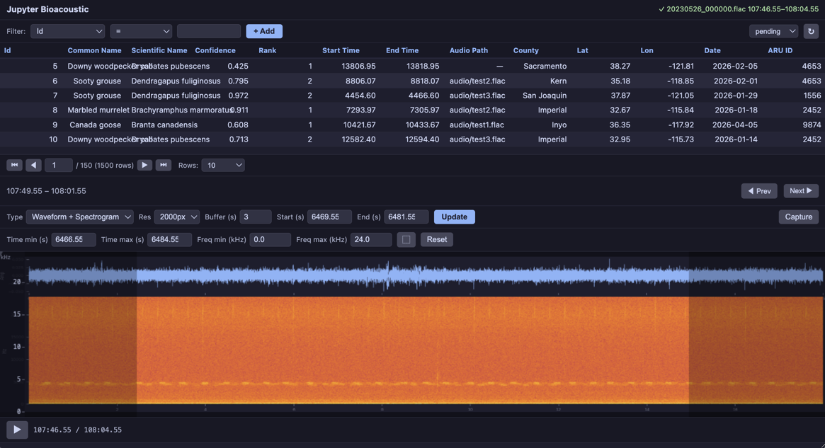
4. Birdsong Bandpass (custom rendering + bandpass)
A bandpass spectrogram focused on 1–8 kHz (typical birdsong range) with the viridis colormap and tighter dynamic range for contrast enhancement. Demonstrates PNG return with a focused frequency window.
def birdsong_spectrogram(mono, sr, width):
    """Bandpass 1-8 kHz with viridis colormap and tighter dynamic range.

    Uses vis.bandpass() for the matrix, then vis.render_png()
    with a custom colormap and 60 dB dynamic range for contrast.
    """
    result = vis.bandpass(mono, sr, width, f_lo=1000.0, f_hi=8000.0)
    png = vis.render_png(
        result['matrix'], width=width, cmap='viridis', dynamic_range_db=60,
    )
    return {
        'png_bytes': png,
        'freq_min': 1000.0,
        'freq_max': 8000.0,
        'freq_scale': 'linear',
    }


BioacousticAnnotator(
    data=DATA,
    audio=AUDIO,
    display_columns=[AUDIO],
    visualizations=[
        'plain', 'mel',
        {'fn': birdsong_spectrogram, 'label': 'Birdsong (1-8 kHz)'},
    ],
).open()