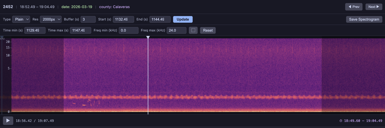
The spectrogram player renders each audio clip as an interactive visualization. Switch between visualization types from the dropdown, adjust resolution, buffer, zoom, and capture the current view as a PNG.
Built-in Visualizations
Five visualization types are included and can be referenced by string name in the visualizations parameter:
| Name | Description |
|---|---|
'linear' (or 'spectrogram') | Linear-frequency STFT magnitude spectrogram |
'mel' | Mel-scale spectrogram — compresses the frequency axis to better match human auditory perception |
'log_frequency' | Log-frequency spectrogram — more visual detail at lower frequencies, similar to a constant-Q transform |
'bandpass' | Bandpass spectrogram focused on 1–8 kHz (typical birdsong range) |
'waveform' | Time-domain waveform plot (amplitude vs. time, not a spectrogram) |
BioacousticAnnotator(
    data=DATA,
    audio=AUDIO,
    display_columns=[AUDIO],
    visualizations=[
        'plain', 'mel', 'log_frequency', 'bandpass', 'waveform'],
).open()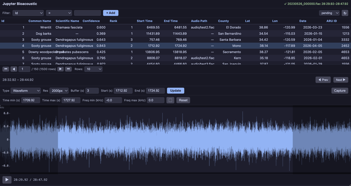
The first item in the list is the default. Use selected:: prefix to override the default (e.g. ['linear', 'selected::mel', 'log_frequency']).
Capture
The capture button saves the current spectrogram/visualization as a PNG file. Configure it with:
capture: True— show the button with default labelcapture: 'Save Spectrogram'— custom button labelcapture: False— hide the buttoncapture_dir: 'spectrograms'— output directory for captures
BioacousticAnnotator(
    data='detections.csv',
    audio='recording.flac',
    capture='Save Spectrogram',
    capture_dir='spectrograms',
).open()
Standalone Usage
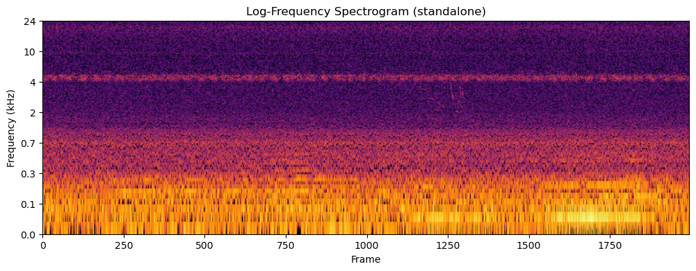
The visualization functions in jupyter_bioacoustic.utils.visualizations can be used outside the widget — for analysis, figures, or custom pipelines.
import soundfile as sf

# Load 15 seconds of audio
audio_data, sample_rate = sf.read(LOCAL_AUDIO_PATH)
duration = 15
mono = audio_data[:sample_rate * duration].mean(axis=1) if audio_data.ndim > 1 else audio_data[:sample_rate * duration]

# Generate a log-frequency spectrogram
result = vis.log_frequency(mono, sample_rate, 2000)
print('matrix shape:', result['matrix'].shape)
print('freq_min:', result['freq_min'], 'freq_max:', result['freq_max'])
print('freq_scale:', result['freq_scale'])
print('matrix min:', result['matrix'].min(), 'max:', result['matrix'].max())

# Plot it standalone — vis.plot() returns (fig, ax)
fig, ax = vis.plot(result, cmap='inferno')
ax.set_title('Log-Frequency Spectrogram (standalone)')
fig.savefig('log-freq-standalone.png')
fig
matrix shape: (256, 1995)
freq_min: 50.0 freq_max: 24000.0
freq_scale: log
matrix min: 0.0 max: 100.40672495176402
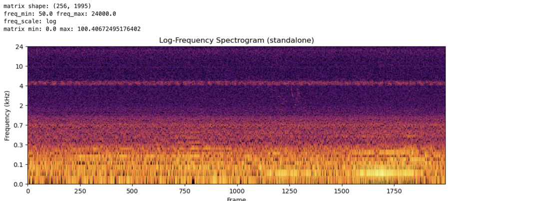
The vis.plot() helper renders any visualization dict as a matplotlib figure. It handles dB normalization, colormap rendering, and frequency-axis tick labels for linear, mel, and log scales.
Available functions: vis.spectrogram(), vis.mel(), vis.log_frequency(), vis.bandpass(), vis.waveform().
vis.render_png(matrix, width, cmap, dynamic_range_db) converts a raw 2D matrix to PNG bytes — useful when building custom visualizations that need colormap control without full matplotlib layout.
Custom Visualizations
Custom visualization functions can be passed directly to the visualizations parameter alongside built-in names. Each function must have the signature (mono, sr, width) and returns a dict with freq_min, freq_max, freq_scale and either
matrix— a 2D numpy array (freq × time). The widget renders it automatically with dB normalization.png_bytes— raw PNG image bytes for full rendering control.
Both forms require freq_min, freq_max, and freq_scale ('linear', 'mel', or 'log'). Matrix returns can optionally include matrix_scale: 'db' to skip the dB conversion.
def my_custum_vis(mono: np.ndarray, sr: float, width: int) -> dict:
    ...
    return {
        'freq_min':  ...,    # min frequency
        'freq_max':  ...,    # max frequency
        'freq_scale':  ...,  # frequency scale: one of linear, mel, or log
        'png_bytes': ...,    # [Required if matrix is None] raw PNG image bytes
        'matrix': ...,       # [Required if png_bytes is None] a 2D numpy array (freq × time)
        'matrix_scale': ..., # [Optional] db or None - only works with 'matrix'
    }
Matrix Example
def birdsong_spectrogram(mono, sr, width):
    """Bandpass 1-8 kHz with viridis colormap and tighter dynamic range.

    Uses vis.bandpass() for the matrix, then vis.render_png()
    with a custom colormap and 60 dB dynamic range for contrast.
    """
    result = vis.bandpass(mono, sr, width, f_lo=1000.0, f_hi=8000.0)
    png = vis.render_png(
        result['matrix'], width=width, cmap='viridis', dynamic_range_db=60,
    )
    return {
        'png_bytes': png,
        'freq_min': 1000.0,
        'freq_max': 8000.0,
        'freq_scale': 'linear',
    }


BioacousticAnnotator(
    data=DATA,
    audio=AUDIO,
    display_columns=[AUDIO],
    visualizations=[
        'plain', 'mel',
        {'fn': birdsong_spectrogram, 'label': 'Birdsong (1-8 kHz)'},
    ],
).open()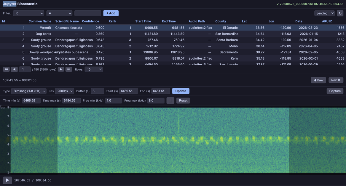
PNG Example
import matplotlib
matplotlib.use('Agg')
import matplotlib.pyplot as plt
import io


def waveform_and_spectrogram(mono, sr, width):
    """Composite: waveform on top, spectrogram on bottom, single PNG.

    This example renders with matplotlib directly for full layout control.
    """
    fig, (ax1, ax2) = plt.subplots(2, 1, figsize=(width / 100, 5),
                                    gridspec_kw={'height_ratios': [1, 3]}, dpi=100)
    fig.subplots_adjust(hspace=0.05)

    t = np.linspace(0, len(mono) / sr, len(mono))
    ax1.plot(t, mono, color='#89b4fa', linewidth=0.3)
    ax1.set_xlim(0, len(mono) / sr)
    ax1.set_ylabel('Amp', fontsize=7, color='#cdd6f4')
    ax1.tick_params(labelsize=6, colors='#6c7086')
    ax1.set_facecolor('#1e1e2e')
    ax1.spines[:].set_visible(False)

    ax2.specgram(mono, Fs=sr, NFFT=1024, noverlap=512, cmap='inferno')
    ax2.set_ylabel('Hz', fontsize=7, color='#cdd6f4')
    ax2.tick_params(labelsize=6, colors='#6c7086')
    ax2.set_facecolor('#1e1e2e')
    ax2.spines[:].set_visible(False)

    fig.patch.set_facecolor('#1e1e2e')
    buf = io.BytesIO()
    fig.savefig(buf, format='png', dpi=100, bbox_inches='tight', pad_inches=0.02)
    plt.close(fig)

    return {
        'png_bytes': buf.getvalue(),
        'freq_min': 0.0,
        'freq_max': sr / 2.0,
        'freq_scale': 'linear',
    }


def inferno_spectrogram(mono, sr, width):
    """Plain spectrogram rendered with 'inferno' colormap via vis.render_png()."""
    result = vis.spectrogram(mono, sr, width)
    png = vis.render_png(result['matrix'], width=width, cmap='inferno')
    return {
        'png_bytes': png,
        'freq_min': result['freq_min'],
        'freq_max': result['freq_max'],
        'freq_scale': result['freq_scale'],
    }


BioacousticAnnotator(
    data=DATA,
    audio=AUDIO,
    display_columns=[AUDIO],
    visualizations=[
        'plain',
        'mel',
        {'fn': inferno_spectrogram, 'label': 'Inferno Colormap'},
        {'fn': waveform_and_spectrogram, 'label': 'Waveform + Spectrogram'},
    ],
).open()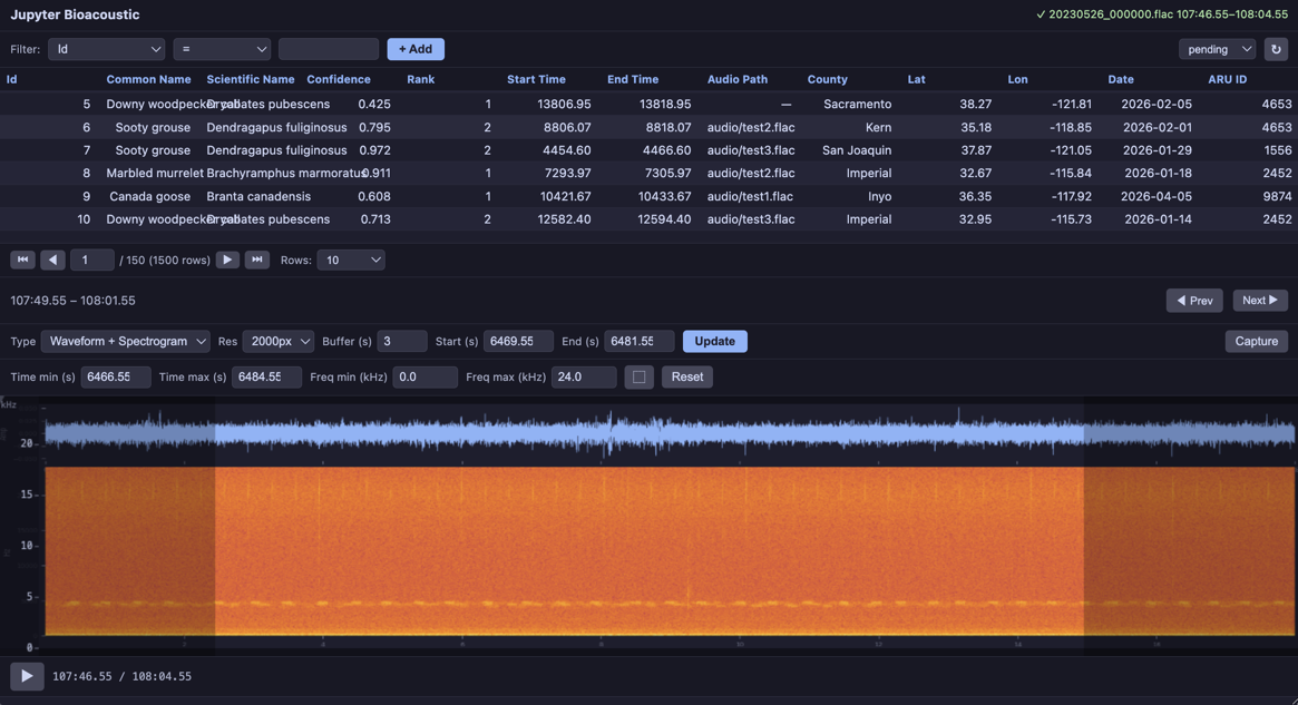
Third-party Visualizations
Any audio library can be wrapped as a custom visualization. The demo notebooks show integrations with:
OpenSoundscape —
Spectrogram.from_audio(),MelSpectrogram,.bandpass()Librosa —
librosa.feature.melspectrogram(), HPSS harmonic separation, chromagramsSciPy —
scipy.signal.spectrogram()with configurable window functions (Hann, Blackman, Kaiser, Tukey)
OpenSoundscapes
BioacousticAnnotator(
    data=DATA,
    audio=AUDIO,
    display_columns=[AUDIO],
    visualizations=[
        'plain',
        {'fn': oss_spectrogram, 'label': 'OSS Linear'},
        {'fn': oss_mel_spectrogram, 'label': 'OSS Mel (400 bins)'},
        {'fn': oss_bandpass, 'label': 'OSS Bandpass (2-10 kHz)'},
    ],
).open()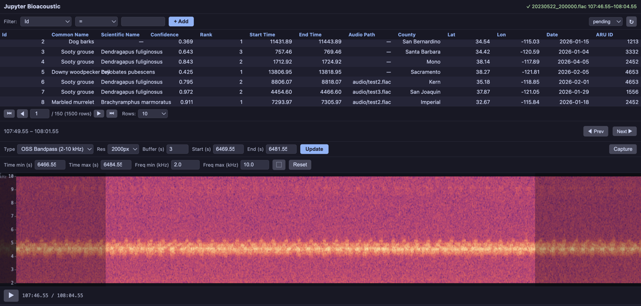
Librosa
BioacousticAnnotator(
    data=DATA,
    audio=AUDIO,
    display_columns=[AUDIO],
    visualizations=[
        'plain',
        {'fn': librosa_mel, 'label': 'Librosa Mel (128 bins)'},
        {'fn': librosa_harmonic, 'label': 'Librosa Harmonic (HPSS)'},
        {'fn': librosa_chromagram, 'label': 'Librosa Chromagram'},
    ],
).open()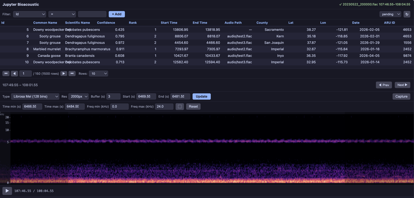
SciPy
BioacousticAnnotator(
    data=DATA,
    audio=AUDIO,
    display_columns=[AUDIO],
    visualizations=[
        'plain',
        {'fn': scipy_hann, 'label': 'SciPy Hann (magma)'},
        {'fn': scipy_blackman, 'label': 'SciPy Blackman (inferno)'},
        {'fn': scipy_kaiser, 'label': 'SciPy Kaiser β=14 (viridis)'},
        {'fn': scipy_tukey, 'label': 'SciPy Tukey α=0.5 (plasma)'},
    ],
).open()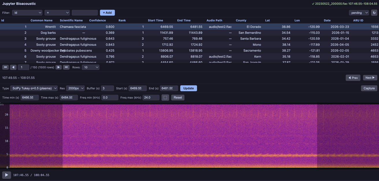
See the Custom Visualizations and Third-Party Libraries notebooks for complete examples.